Tuesday, September 27, 2011

Photoshop- Brushed Metal Texture


This is possibly the easiest texture you will ever create, yet it looks great.

*One thing you should know is that in creating this texture the edges will need to be cropped to show only the part you want. So you should add an extra say 100px to the size.

1. first fill you your document with a good gray color (I used #555555)
2. Go to filter>noise>add noise. Set the amount to 25% and the setting to uniform, make sure monochromatic is checked.
3. Now to finish up go to filter>blur>motion blur. set the direction to 90, and play around with the distance until you get what you want (I went with 64px) and that's it nothing to it

*For another great look try adding some black grunge brushes on a low opacity or multiply.

Tuesday, September 20, 2011

Photoshop- Glossy Banner

Today I'm going to show you how to create a simple, yet still nice looking banner. I actually used a variation of this banner on a recent project.

1.Start off by creating a new document 950*150 and fill the background white.

2. Apply the following gradient.

3. So we've got something that looks like a nice backdrop for a banner but it's still missing something, a border. Go ahead and apply a stroke to the background with the following: Position:inside, Size 5px, and use a dark gray like #404040.

4. Now for the content, add a good size text (I used 48px) to the middle of the banner, again use a dark gray(not black). The reason you don't want to use black is because we are now going to add a drop shadow.
Use the following for the drop shadow: distance 2px, size 2px, 120 degrees, and set the mode to multiply.

5. Finally it's time for the gloss. Using the Pen Tool create a shape similar to the one below.
6. Ctrl+click on the shapes layer, then select inverse( you can use the shortcut Ctrl+I), and delete the selected white.
7. Set the opacity of the white to 34% and your done.

Thursday, September 15, 2011

Freelance- lesson learned 'Communication is key'

I'm back from a few days off from posting and I can now make my first post about freelancing. While I wish I could say I was off having fun, the last few days have been... well less than good. Everything that happened could have been avoided if I had just followed one simple principle, communication.

 It started with a client whom I had worked with previously, we had started a project but had discussed no real timeline (see there, right there I should have gotten more information). Having no real due date I decided to take a day off, sleep in, catch a movie, then more sleep. The next day I awoke to a text that made my stomach just drop, "if you haven't started , disregard this project I'm on a timeline". I immediately called back and by the tone of my client you would think I had been missing for months. It was at that point I realized, wow I really messed up. I managed to save the project but at a cost and was stressed beyond belief as I tried to finish by deadline. 

Excuse me if I skip over most of the details of the day, but I want to get to my key point. Communication is key if you're going to make it. When I talked to the client he had to mention it to me, what's more embarrassing than that. What I learned is that you have to imagine that the client is sitting around, doing nothing but waiting on your next word. You leave them without an update and they're lost. You must let them know what is going on at any point worth mentioning, you can only gain from communicating.

My question to you is this, personally if you hired a freelance is there a point where you would not want to here from them?

Sunday, September 11, 2011

Photoshop- Intro to patterns


Patterns can be a fundamental part of any design. The best part is that they're not very hard to create.

To best teach how to create a pattern I'm going to create possibly the easiest one, the diagonal stripe.


1. Create a new document measuring 4*4 and make its background transparent.
2. now zoom in all the way and grab your pencil tool and set it at 1px black
3. draw a diagonal line like the one below.


4. Now grab the rectangular marquee tool and select the entire document.
5. Click edit then define pattern, and your done.

Saturday, September 10, 2011

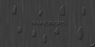
Photoshop- Raindrops

In this tutorial we will be creating raindrops. Now this same effect can also be added to text and other images.


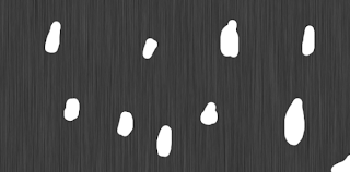
1. start of with your choice of size, then add white brush strokes similar to the example below.


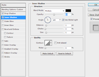
2. Add the following effects to the strokes.

3.Finally set the layer style to overlay and the fill to 0%.
That's all there is to it. now you can simply copy the layer style to whatever you'd like.

Friday, September 9, 2011

Photoshop- Reflections

Difficulty 1/5

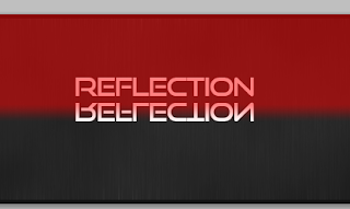
Today I'll be teaching you how to create reflections in Photoshop. Reflections are a great visual effect to really make your design shine. They're also nearly as easy as adding text.

1. Start off with a background of your choice. The document I'll be using is 500*225 and a quick background I made. Add some text on top of the background.


2.Duplicate this layer by either right clicking on the layer or clicking the layer and hitting ctrl+J

3.Rastersize this layer by right clicking on it and selecting rastersize layer.
*Tip and easy way to rastersize graphic layers (such as icons) is to create a new blank layer below it. Then click the graphics layer and hit ctrl+e to merge.
4.Flip this layer vertically. You can do this by going to the edit menu at the top, then go to transform then flip vertically.


You should now have this-


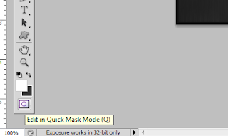
5.Now for the magic. On the now flipped layer click the quick mask button(see picture below), then click on the gradient button.


6. draw a gradient from the top of the flipped text to the bottom. See the picture below for an example. After this click the quick mask button again to finish.


7.You'll now see a selection box, hit delete or backspace a couple of times. Now lower the opacity or fill to your liking, I used 20%. Congratulations your now done and should have a similar picture to the one below.


Saturday, September 3, 2011

Photoshop- Soft noise texture

For my first ever post I'll be teaching you how to create the below effect
Now onto the tutorial
1. Create a new document with the size 800*800. You can leave the other options as they are.
2.Fill the background layer with a good color. Personally I find that darker colors look better, so I went with #2a2a2a

3.Create a new layer and fill it with white. Now go to Filter-Noise-Add Noise. Set the amount to 25%, the type to Gaussian,  and make sure monochromatic is checked.


4. Almost there click on the new layer and use the keyboard shortcut Ctrl+I to inverse the colors. Now set the layers fill to 80%, and type to multiply.

*5. Now some optional touch up work. Select the background layer and use the keyboard shortcut Ctrl+U to adjust the color. That's it now go show it off.


Your Ad Here